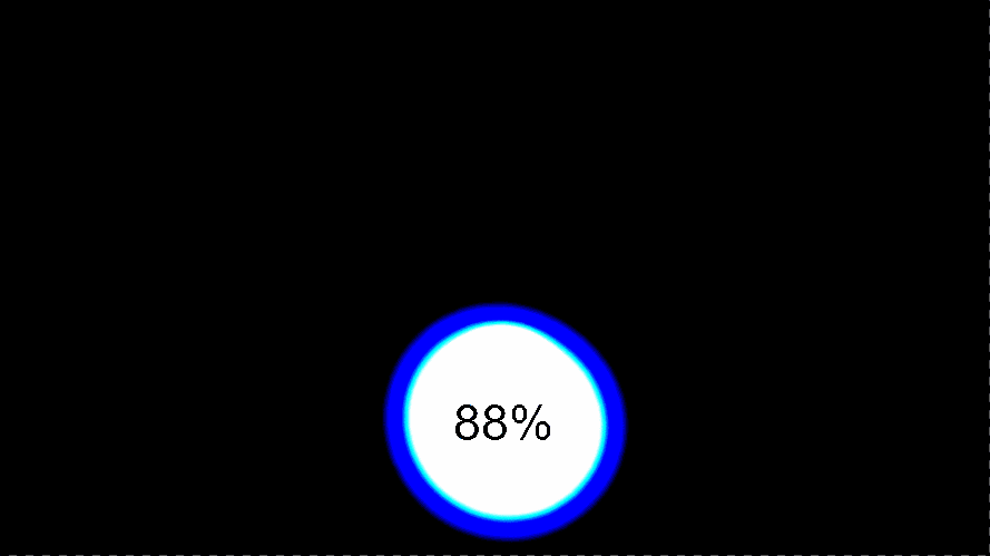
CSS液体融合效果,点击查看效果
<!DOCTYPE html>
<html lang="en">
<head>
    <meta charset="UTF-8">
    <meta name="viewport" content="width=device-width, initial-scale=1.0">
    <title>CSS液体融合效果</title>
    <style>
        body {
            margin: 0;
        }
        .container {
            min-height: 100vh;
            background-color: #192a56;
            display: flex;
            justify-content: center;
            align-items: center;
            flex-direction: column;
            filter: contrast(30);
        }
        .drop {
            position: absolute;
            width: 100px;
            height: 100px;
            background-color: #fff;
            border-radius: 50%;
            filter: blur(20px);
            opacity: 0;
            animation: 2.5s drop linear infinite;
        }
        .drop:nth-child(2) {
            animation-delay: .5s;
        }
        .drop:nth-child(3) {
            animation-delay: .7s;
        }
        .collection {
            width: 100px;
            height: 100px;
            background-color: #fff;
            border-radius: 50%;
            filter: blur(20px);
            animation: 3s collection linear infinite;
        }
        span {
            position: absolute;
            font-family: Helvetica;
            font-size: 30px;
        }
        @keyframes drop {
            0% {
                transform: scale(.7) translateY(-600%);
                opacity: 0;
            }
            50% {
                transform: scale(.4) translateY(-80%);
                opacity: 1;
            }
            100% {
                transform: scale(.3) translateY(0px);
            }
        }
        @keyframes collection {
            0% {
                transform: scale(1) rotate(0deg);
            }
            50% {
                transform: scale(1.3) rotate(180deg);
                width: 90px;
                border-top-left-radius: 40%;
                border-bottom-left-radius: 45%;
            }
            100% {
                transform: scale(1) rotate(360deg);
            }
        }
    </style>
</head>
<body>
    <div class="container">
        <div class="drop"></div>
        <div class="drop"></div>
        <div class="drop"></div>

        <div class="collection"></div>
        <span>88%</span>
      </div>
</body>
</html>