颜色搭配工具:https://flatuicolors.com/
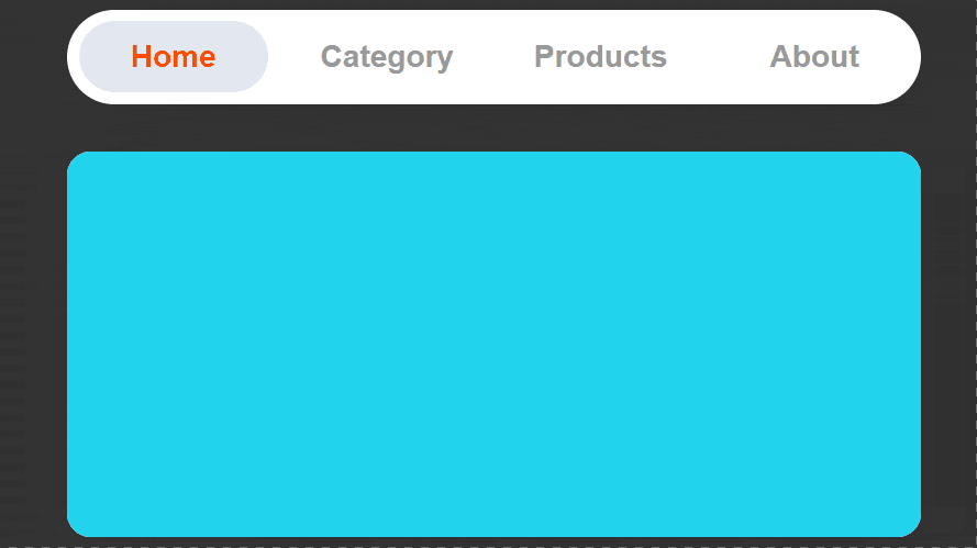
CSS Border-Radius 所见即所得圆角效果工具:https://9elements.github.io/fancy-border-radius/
注意:github.io不能访问的,可以点击这里
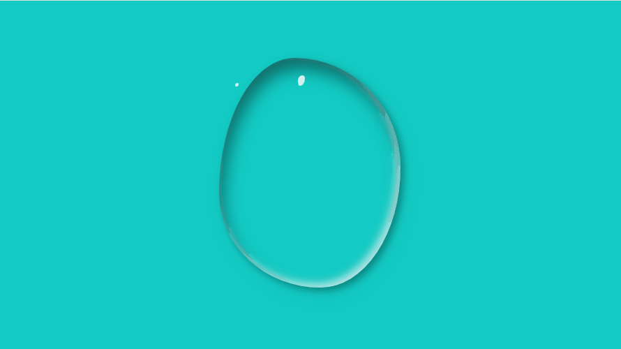
用CSS实现逼真的水滴效果,点击查看效果
<!DOCTYPE html>
<html lang="en">
<head>
    <meta charset="UTF-8">
    <meta name="viewport" content="width=device-width, initial-scale=1.0">
    <title>用CSS实现逼真的水滴效果</title>
    <style>
        body {
            width: 100vw;
            height: 100vh;
            display: flex;
            justify-content: center;
            background-color: #12CBC4;
        }
        .water {
            margin-top: 200px;
            width: 520px;
            height: 657px;
            border-radius: 59% 41% 50% 50% / 69% 50% 50% 31%;
            box-shadow: inset 10px 30px 50px rgba(0,0,0,0.5),
                        10px 10px 20px rgba(0, 0, 0, 0.3),
                        15px 25px 50px rgba(0,0,0,0.05),
                        inset -10px -10px 25px rgba(255,255,255,0.8);
            animation: action 3s linear infinite alternate;
        }
        .water::after {
            content: '';
            width: 20px;
            height: 30px;
            position: absolute;
            top: 258px;
            left: 50%;
            background-color: rgba(255,255,255,0.8);
            border-radius: 60% 40% 73% 27% / 54% 26% 74% 46% ;
        }
        .water::before {
            content: '';
            width: 10px;
            height: 10px;
            position: absolute;
            top: 280px;
            left: 47%;
            background-color: rgba(255,255,255,0.8);
            border-radius: 60% 40% 73% 27% / 54% 26% 74% 46% ;
        }
        @keyframes action{
            25%{
                border-radius: 28% 72% 30% 70% / 73% 39% 61% 27%;
            }
            60%{
                border-radius: 55% 45% 58% 42% / 45% 56% 44% 55%;
            }
            100%{
                border-radius: 37% 63% 46% 54% / 58% 56% 44% 42%;
            }
        }
    </style>
</head>
<body>
    <div class="water"></div>
</body>
</html>