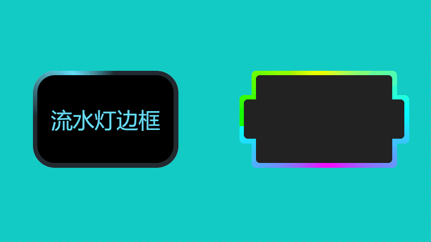
纯CSS实现动态流水灯边框效果,点击查看效果
<!DOCTYPE html>
<html lang="en">
<head>
    <meta charset="UTF-8">
    <meta name="viewport" content="width=device-width, initial-scale=1.0">
    <title>纯CSS动态流水灯边框效果</title>
    <style>
        * {
            margin: 0;
            padding: 0;
            box-sizing: border-box;
        }
        body {
            min-height: 100vh;
            background-color: #12CBC4;
            display: flex;
            justify-content: space-around;
            align-items: center;
        }
        .box1 {
            width: 600px;
            height: 400px;
            line-height: 400px;
            background-color: #fff;
            border-radius: 5vmin;
            color: #66ddf7;
            font-size: 5vmin;
            position: relative;
            overflow: hidden;
            text-align: center;
            z-index: 1;
        }
        .box1::before{
            content: "";
            width: 200%;
            height: 200%;
            background-color: #22292f;
            position: absolute;
            left: -50%;
            top:-58%;
            background-image: conic-gradient(
                transparent, #66ddf7, transparent 30%
            );
            z-index: -2;
            animation: rotate 5s linear infinite;
        }
        .box1::after {
            content: "";
            position: absolute;
            inset: 1vmin;
            background-color: #000;
            border-radius: 4vmin;
            z-index: -1;
        }
        @keyframes rotate {
            to {
                transform:  rotate(360deg);
            }
        }

        /* 彩虹色 */
        .box2 {
            width: 600px;
            height: 400px;
            position: relative;
        }
        .box2::before {
            content: "";
            position: absolute;
            inset: 0;
            background: conic-gradient(
                from var(--a), #0f0, #ff0, #0ff, #f0f, #0ff
            );
            border-radius: 20px;
            animation: rotating 5s linear infinite;
        }
        .box2::after {
            content: "";
            position: absolute;
            inset: 0;
            background: conic-gradient(
                from var(--a), #0f0, #ff0, #0ff, #f0f, #0ff
            );
            border-radius: 20px;
            animation: rotating 5s linear infinite;
            /* filter: blur(40px); */
            opacity: 0.75;
        }
        .box2 span {
            position: absolute;
            inset: 1vmin;
            background: #222;
            border-radius: 16px;
            z-index: 1;
        }
        @property --a {
            syntax: '<angle>';
            inherits: false;
            initial-value: 0deg;
        }
        @keyframes rotating {
            0% {
                --a:  0deg;
            }
            100% {
                --a: 360deg;
            }
        }
        .box2 .box2 {
            position: absolute;
            inset: 0 -50px;
            top: 100px;
            height: 200px;
            width: 700px;
        }
    </style>
</head>
<body>
    <div class="box1">流水灯边框</div>
    <div class="box2"><span></span>
        <div class="box2"><span></span></div>
    </div>
</body>
</html>