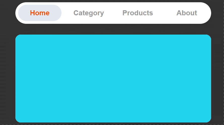
纯CSS实现tab滑块选项卡效果,点击查看效果
<!DOCTYPE html>
<html lang="en">
<head>
    <meta charset="UTF-8">
    <meta name="viewport" content="width=device-width, initial-scale=1.0">
    <title>纯CSS实现tab滑块选项卡效果</title>
    <style>
        :root {
            font-size: 16px;
            --nav-item-width: 9rem;
            --nav-item-height: 2rem;
            --nav-item-padding: 1rem;
            --transition-speed: .5s;
        }
        .container {
            display: flex;
            flex-direction: column;
            justify-content: center;
            align-items: center;
            min-height: 100vh;
            font-family: Helvetica;
            background-color: #e2e8f0;
        }
        nav {
            background-color: #fff;
            padding: var(--nav-item-padding) 0;
            border-radius: var(--nav-item-height);
            position: relative;
            box-shadow: 0 4px 12px rgba(0, 0, 0, .1);
        }
        nav::after {
            content: "";
            display: block;
            width: calc(var(--nav-item-width) - var(--nav-item-padding));
            height: calc(var(--nav-item-height) + var(--nav-item-padding));
            background: #e2e8f0;
            position: absolute;
            top: 0;
            left: 0;
            margin: calc(var(--nav-item-padding) / 2);
            border-radius: var(--nav-item-height);
            transition: var(--transition-speed) all cubic-bezier(0.42, 0, 0.51, 1.49);
        }
        nav ul {
            list-style: none;
            margin: 0;
            padding: 0;
            display: flex;
            align-items: center;
            height: var(--nav-item-height);
            position: relative;
            z-index: 10;
        }
        nav ul li {
            font-size: 1.3rem;
            font-weight: 600;
            width: var(--nav-item-width);
            text-align: center;
        }
        nav ul li label {
            color: #999;
        }
        #nav-home:checked ~ nav::after {
            transform: translateX(0);
        }
        #nav-category:checked ~ nav::after {
            transform: translateX(calc(var(--nav-item-width) * 1));
        }
        #nav-products:checked ~ nav::after {
            transform: translateX(calc(var(--nav-item-width) * 2));
        }
        #nav-about:checked ~ nav::after {
            transform: translateX(calc(var(--nav-item-width) * 3));
        }

        #nav-home:checked ~ nav label[for="nav-home"],
        #nav-category:checked ~ nav label[for="nav-category"],
        #nav-products:checked ~ nav label[for="nav-products"],
        #nav-about:checked ~ nav label[for="nav-about"]
        {
            color: #ff4c00;
        }

        input[type="radio"] {
            display: none;
        }
        .content {
            width: calc(var(--nav-item-width) * 4);
            height: 400px;
            background-color: #fff;
            margin-top: var(--nav-item-height);
            border-radius: var(--nav-item-padding);
            display: flex;
            overflow: hidden;
            box-shadow: 0 4px 12px rgba(0, 0, 0, .1);
        }
        .content div {
            width: calc(var(--nav-item-width) * 4);
            background-color: #000;
            flex-shrink: 0;
            transition: var(--transition-speed) all ease-in-out;
        }
        .content div:nth-child(1) {
            background-color: #22d3ee;
        }
        .content div:nth-child(2) {
            background-color: #4ade80;
        }
        .content div:nth-child(3) {
            background-color: #f472b6;
        }
        .content div:nth-child(4) {
            background-color: #facc15;
        }
        #nav-home:checked ~ .content div {
            transform: translateX(0);
        }
        #nav-category:checked ~ .content div {
            transform: translateX(calc(var(--nav-item-width) * 4 * -1));
        }
        #nav-products:checked ~ .content div {
            transform: translateX(calc(var(--nav-item-width) * 4 * -2));
        }
        #nav-about:checked ~ .content div {
            transform: translateX(calc(var(--nav-item-width) * 4 * -3));
        }
    </style>
</head>
<body>
    <div class="container">
        <input type="radio" name="nav" id="nav-home" checked>
        <input type="radio" name="nav" id="nav-category">
        <input type="radio" name="nav" id="nav-products">
        <input type="radio" name="nav" id="nav-about">
        <nav>
            <ul>
                <li><label for="nav-home"><span>Home</span></label></li>
                <li><label for="nav-category"><span>Category</span></label></li>
                <li><label for="nav-products"><span>Products</span></label></li>
                <li><label for="nav-about"><span>About</span></label></li>
            </ul>
        </nav>
        <div class="content">
            <div></div>
            <div></div>
            <div></div>
            <div></div>
        </div>
    </div>
</body>
</html>