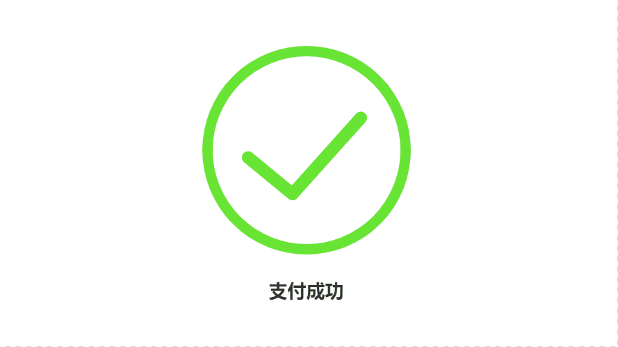
CSS+SVG结果页图标动画,点击查看效果
<!DOCTYPE html>
<html lang="en">
<head>
    <meta charset="UTF-8">
    <meta name="viewport" content="width=device-width, initial-scale=1.0">
    <title>CSS+SVG结果页图标动画</title>
    <style>
        body {
            min-height: 100vh;
            display: flex;
            justify-content: center;
            align-items: center;
            flex-direction: column;
        }
        h2 {
            font-family: Arial, Helvetica, sans-serif;
            font-size: 36px;
            margin-top: 40px;
            color: #333;
            text-align: center;
            opacity: 0;
        }
        input[type="checkbox"]:checked ~ h2 {
            animation: .6s title ease-in-out;
            animation-fill-mode: forwards;
            animation-delay: 1.2s;
        }
        .circle {
            stroke-dasharray: 1194;
            stroke-dashoffset: 1194;
        }
        input[type="checkbox"]:checked + svg .circle {
            animation: circle 1s ease-in-out;
            animation-fill-mode: forwards;
        }
        .tick {
            stroke-dasharray: 350;
            stroke-dashoffset: 350;
        }
        input[type="checkbox"]:checked + svg .tick {
            animation: tick 1s ease-in-out;
            animation-fill-mode: forwards;
            animation-delay: .95s;
        }
        @keyframes circle {
            from {
                stroke-dashoffset: 1194;
            }
            to {
                stroke-dashoffset: 2388;
            }
        }
        @keyframes tick {
            from {
                stroke-dashoffset: 350;
            }
            to {
                stroke-dashoffset: 0;
            }
        }
        @keyframes title {
            from {
                opacity: 0;
            }
            to {
                opacity: 1;
            }
        }
    </style>
</head>
<body>
    <div>
        <input type="checkbox" checked style="display: none;">
        <svg width="400" height="400">
            <circle class="circle" fill="none" stroke="#68e534" stroke-width="20" cx="200" cy="200" r="190" stroke-linecap="round" transform="rotate(-90 200 200)"></circle>
            <polyline class="tick" fill="none" stroke="#68e534" stroke-width="24" points="88, 214 173, 284 304, 138" stroke-linecap="round" stroke-linejoin="round"></polyline>
        </svg>

        <h2>支付成功</h2>
    </div>
</body>
</html>